A bit about process
Graphic design is visual communication. In order to communicate well about something, I have to understand it. I begin by finding out as much as I can about the client’s business, product, target audience and competitors. I give clients a questionnaire as a starting point. Usually there is something unique about the organization or product, so I research whatever that is and I try to make connections that I will express in the design.

Notebook sketches
I freely sketch ideas in my notebook, and see where that leads. I develop the most viable ones by hand and in the computer, going back and forth several times.

developed Sketch
The first round I present is rather rough, and in black and white. It’s best not to distract with color at first. People have emotional responses to color, so I leave color out and concentrate on form in the first round. I present 3 to 5 concepts to start, and the client chooses a direction to pursue from these. In the second round, I refine the design and incorporate client feedback.

final
I continue to refine in subsequent rounds, adding color, trying different type, and moving elements around until the design falls into place.
A more in depth look
Before & After
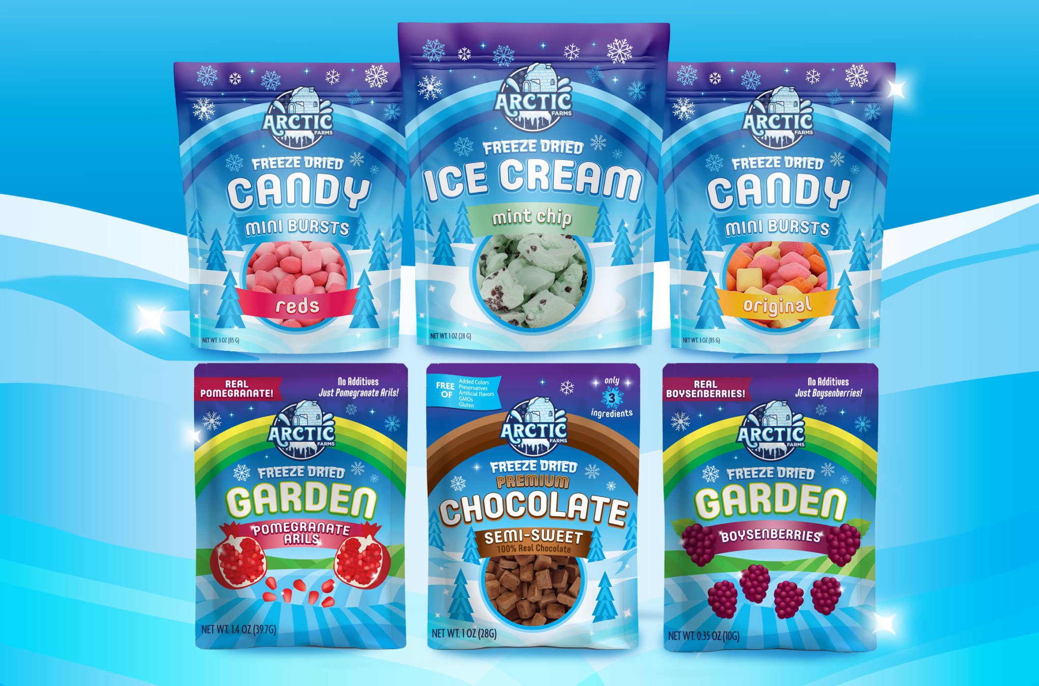
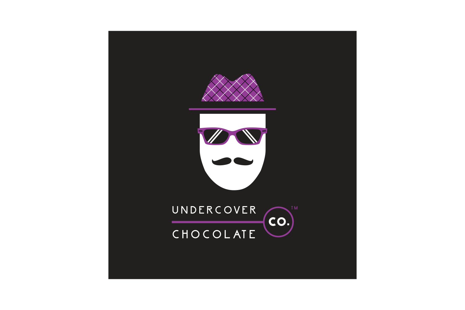
Many of my clients are small businesses, and they have a logo or packaging that needs an upgrade, to help their businesses grow. Sometimes, I can start with the existing concept and design something new. Other times, they have some brand recognition already, so I have to keep existing elements, but improve the overall appearance. The improvement can be subtle or dramatic.
Below are some examples. Navigate with arrows on left and right.

BEFORE

AFTER Very similar, but more graceful.
BEFORE

AFTER Bolder, clearer, more cohesive.

BEFORE
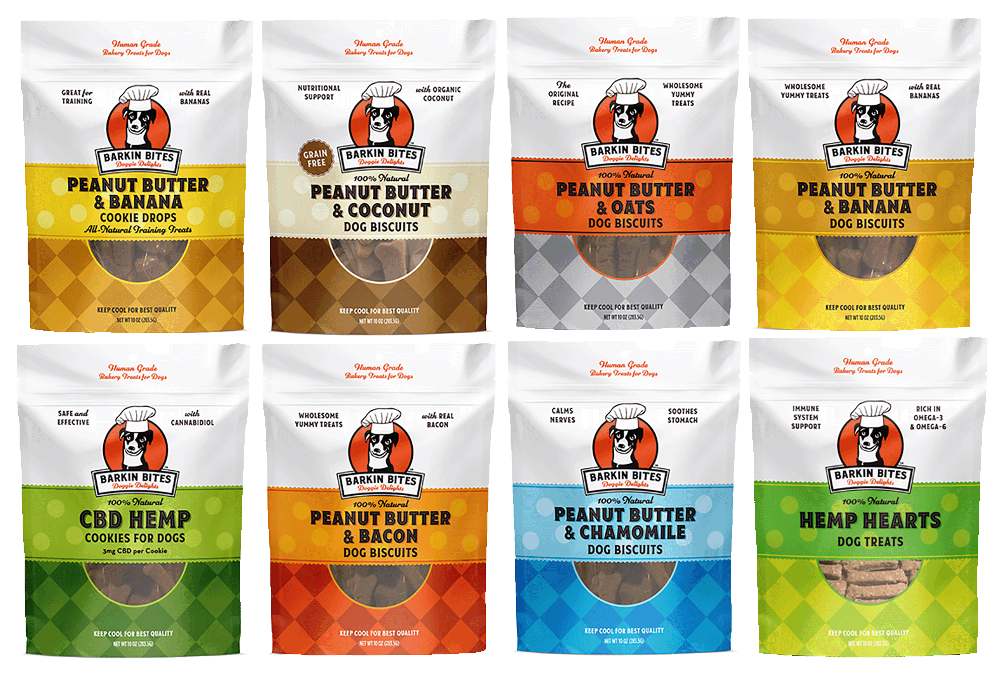
AFTER More sophisticated, with vintage style.

BEFORE

AFTER Improved typography and overall look.