case Study
Arctic Farms Packaging
This client came to me with a logo and basic bags for his freeze-dried ice cream line. He wanted to keep the logo and elevate the packaging — and the project became a strong example of how a cohesive design system can unify a broad, growing product range.
I carried forward the sweeping stripes from his existing bags as a structural anchor, preserving any shelf recognition the product had already built, and offered some alternatives.
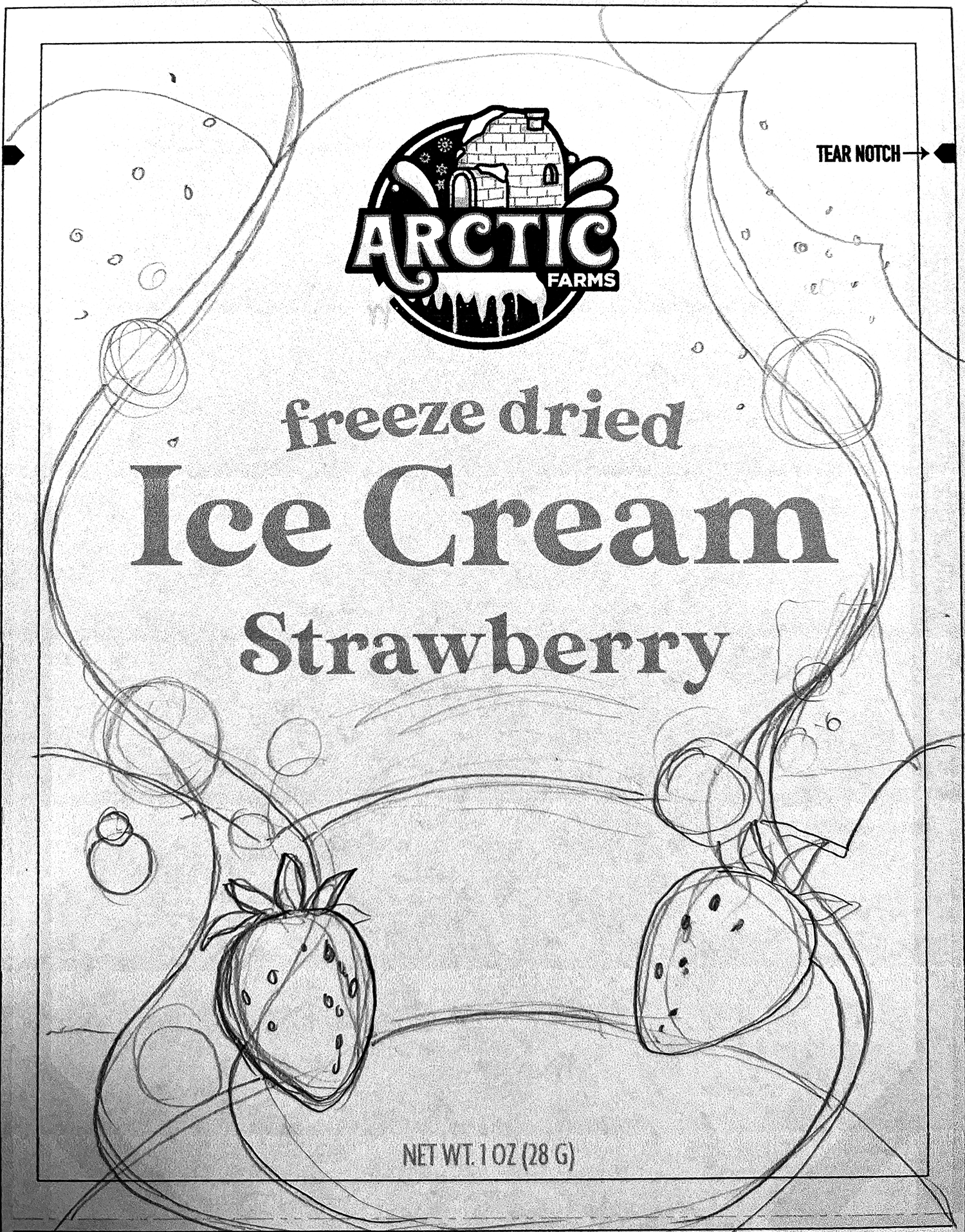
I begin each new project by sketching by hand. In this example, I used the actual size of the front of the bag. This way, I can make sure everything fits.
It’s important to keep in mind the target audience. Although I offered the client a range, overall this is a retail packaging system designed for a specific audience — kids, novelty snack buyers, impulse purchase at point-of-sale.
The product should look like a fun treat.
Below, I chose two flavors to show how they could be differentiated; there are four pairs.




An Expandable Design
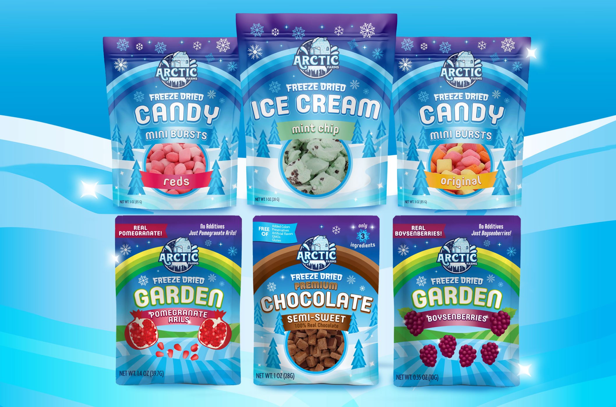
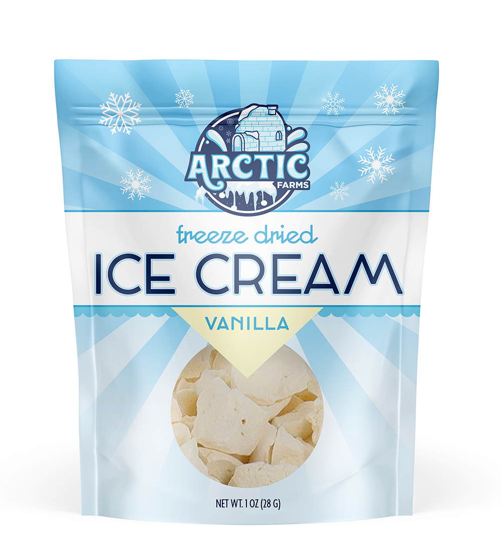
The client selected the third option from the top, which I then developed into the full packaging system. Brand architecture was central to the process — the goal was packaging that would feel consistent and recognizable across stores and across products, and that could accommodate new lines as the company grew.
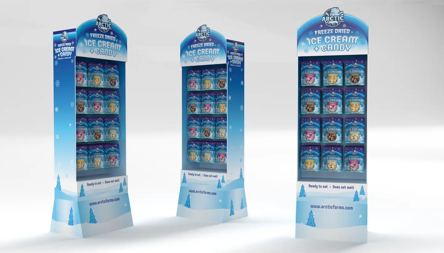
That investment has paid off. Arctic Farms has since expanded into a Garden line and a Chocolate line alongside the original Ice Cream and Candy products, and all of them read unmistakably as part of the same family.
The products are now carried at Target, Fresh Market, and a growing number of other retailers.