
Michele’s granola
I first met Michele in the early 2000s, when she was selling her homemade granola at Baltimore farmers markets. As one of my earliest clients, I had the opportunity to develop the identity and packaging as the company grew from a local favorite to a national brand. Today, her granola is available in Whole Foods stores nationwide, and it’s still a thrill to spot her branded delivery trucks on the road.
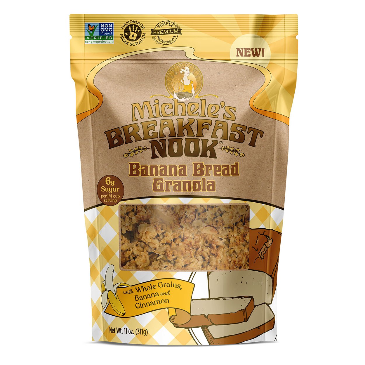
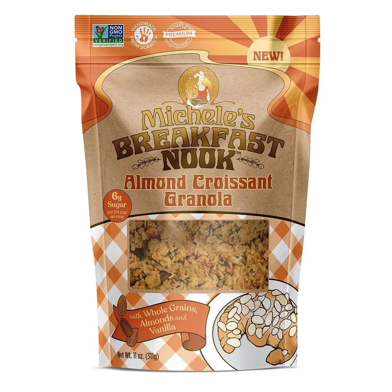
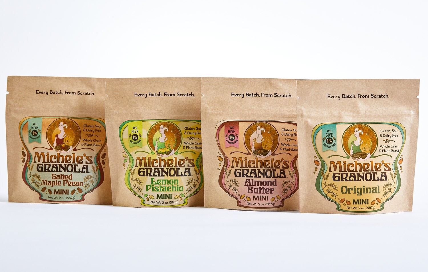
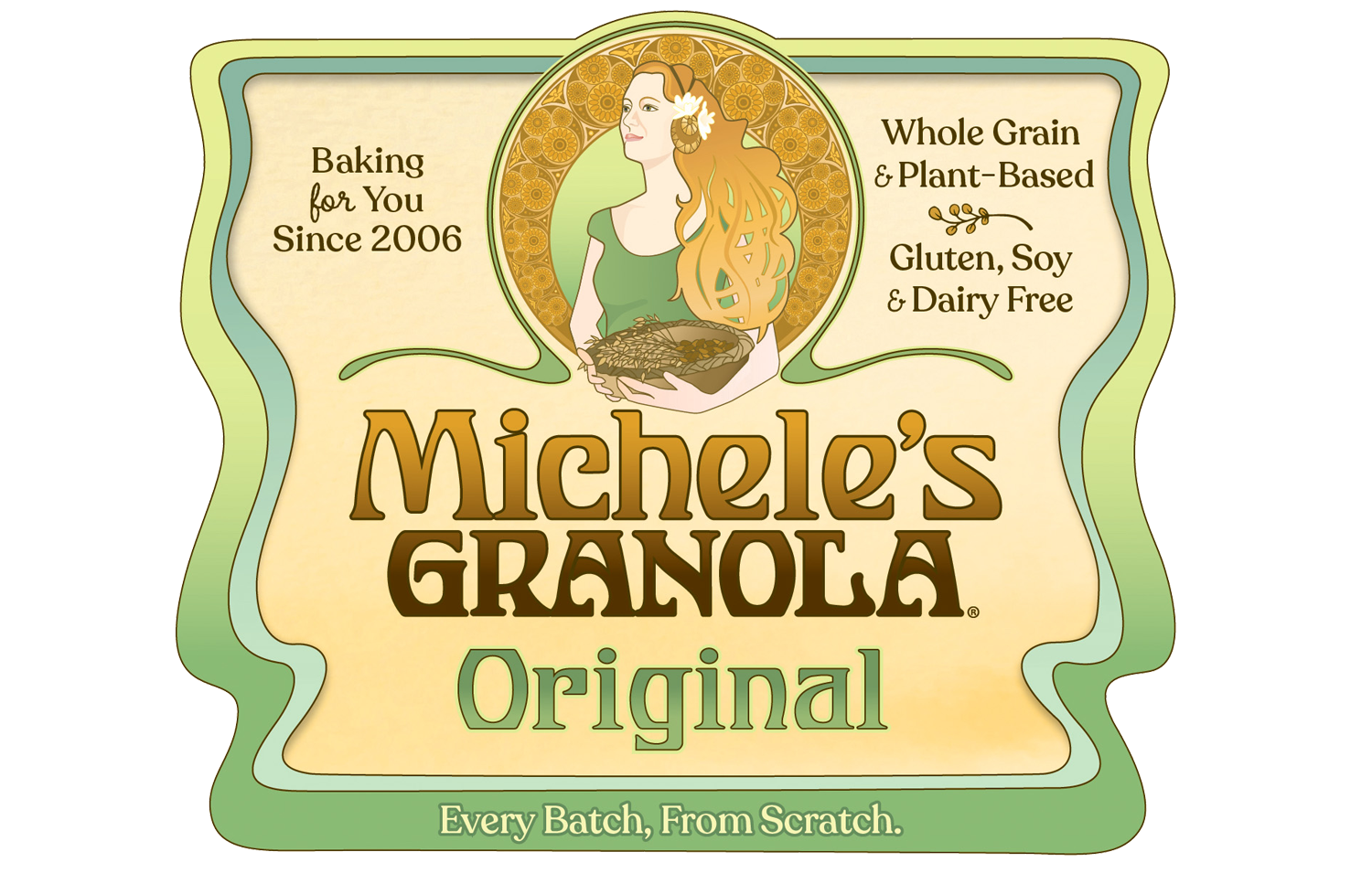
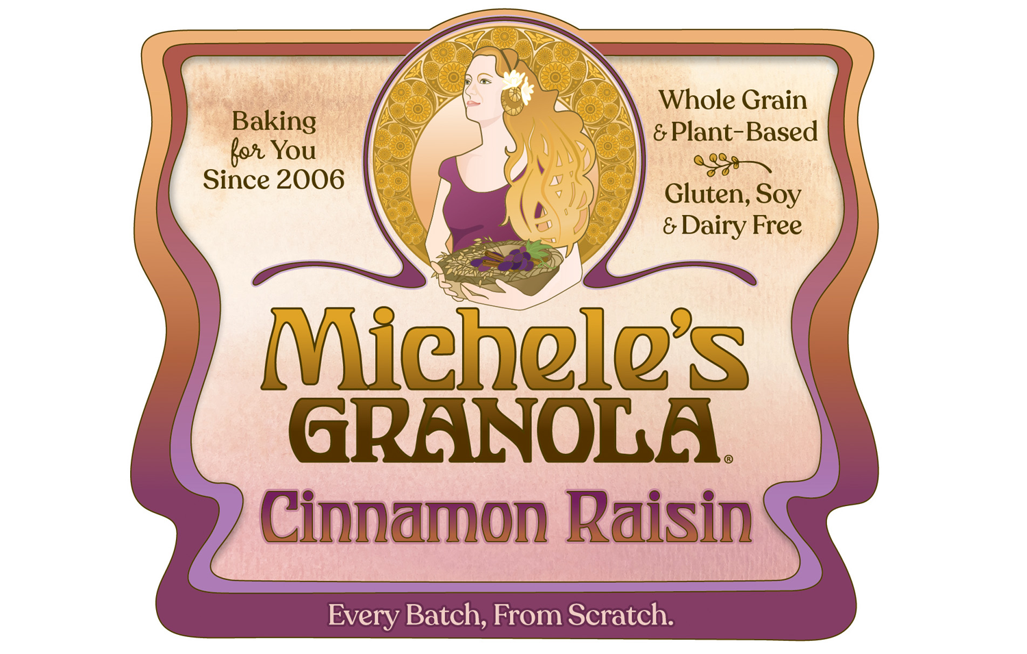
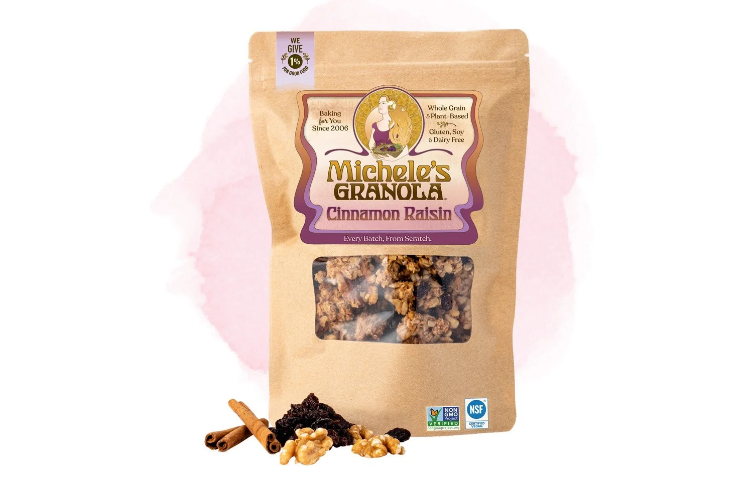
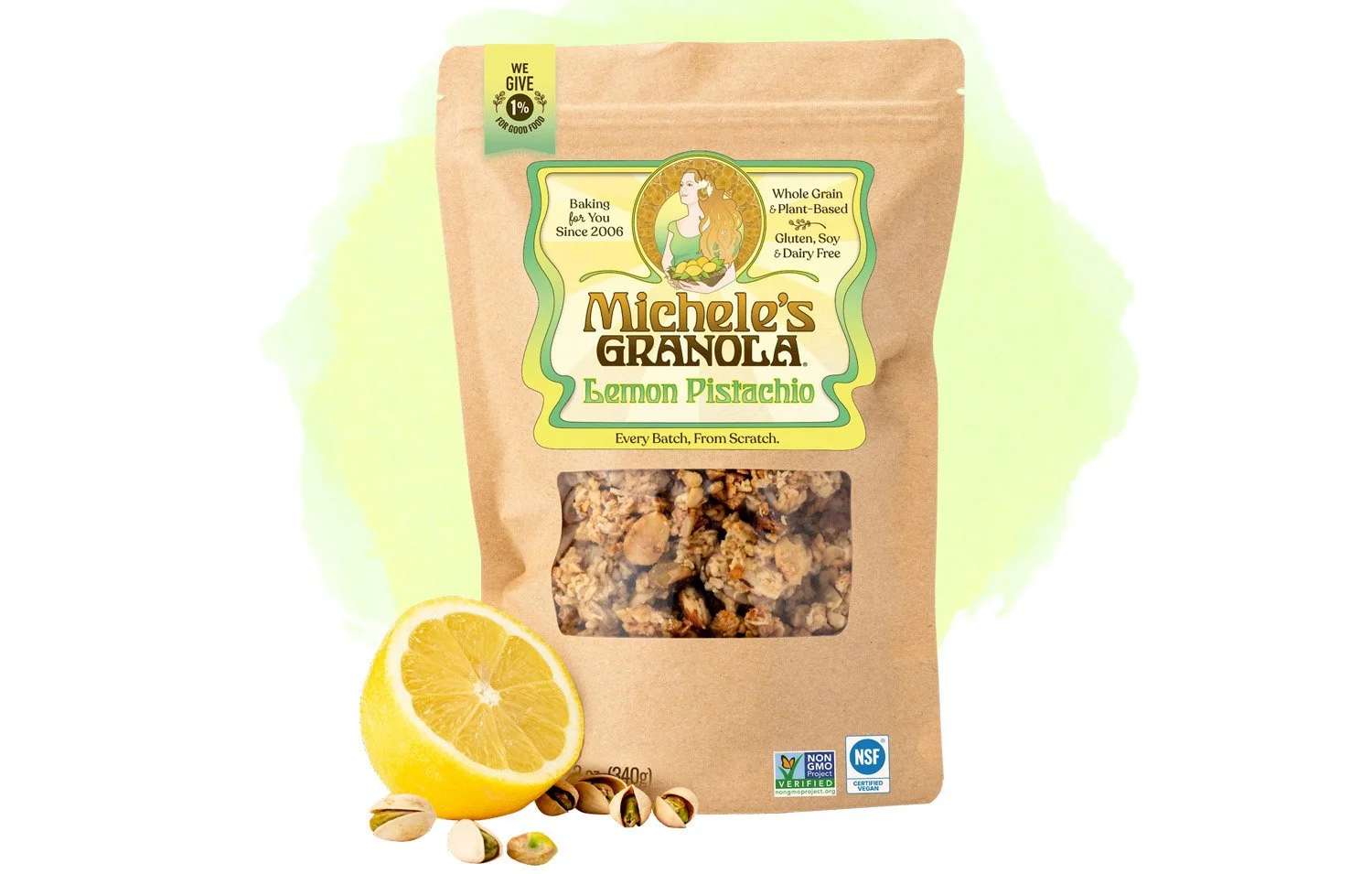
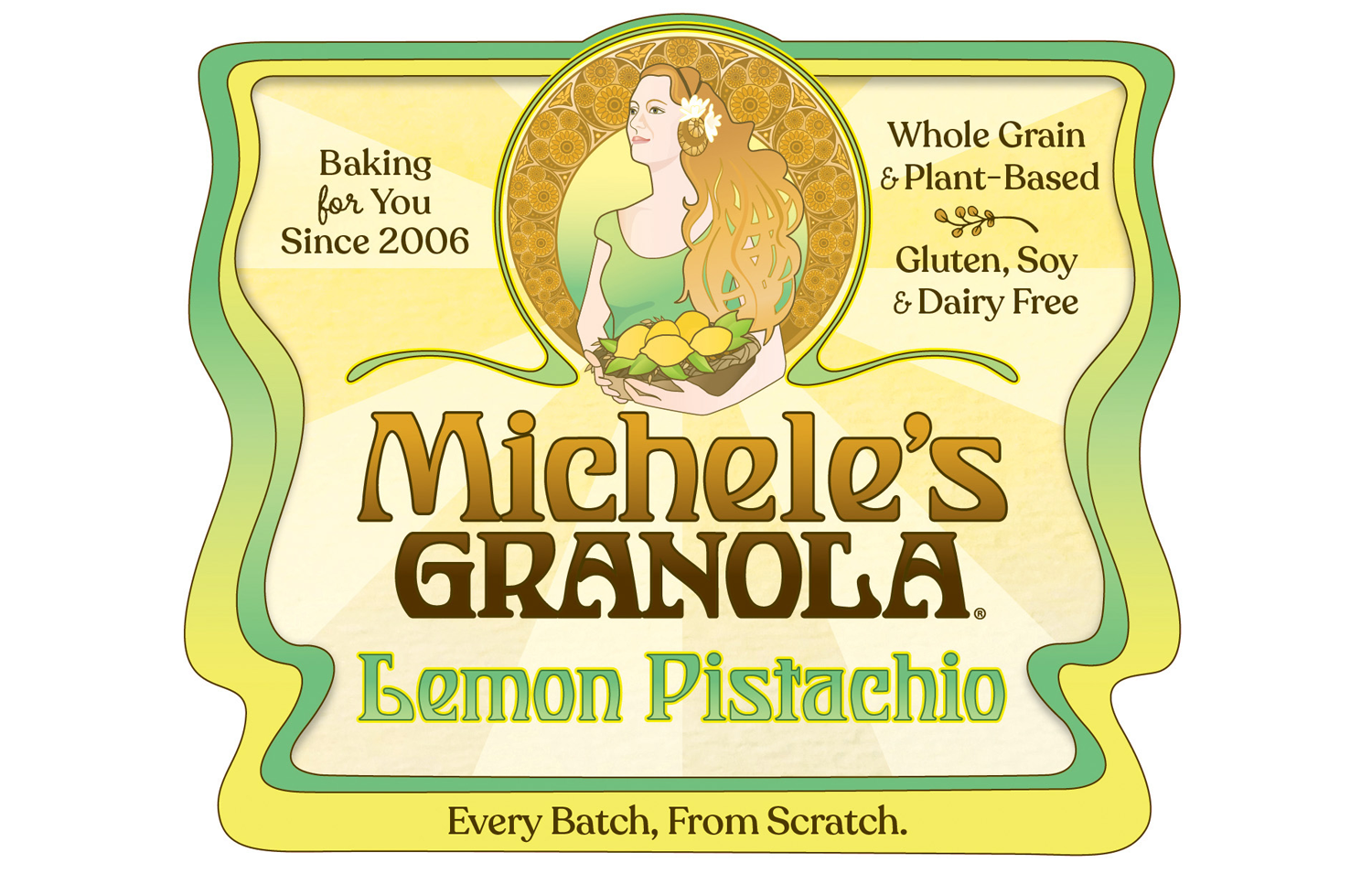
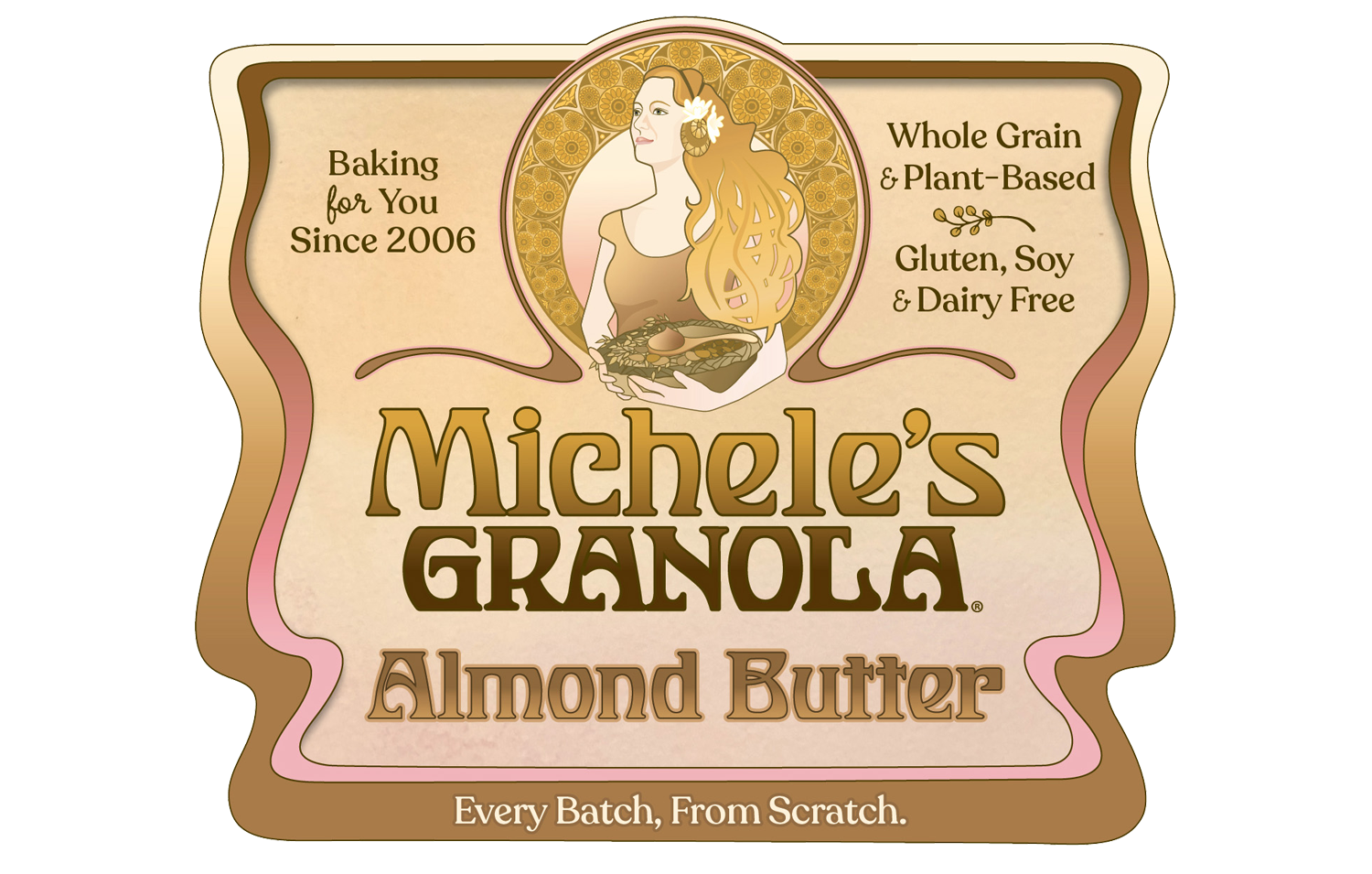
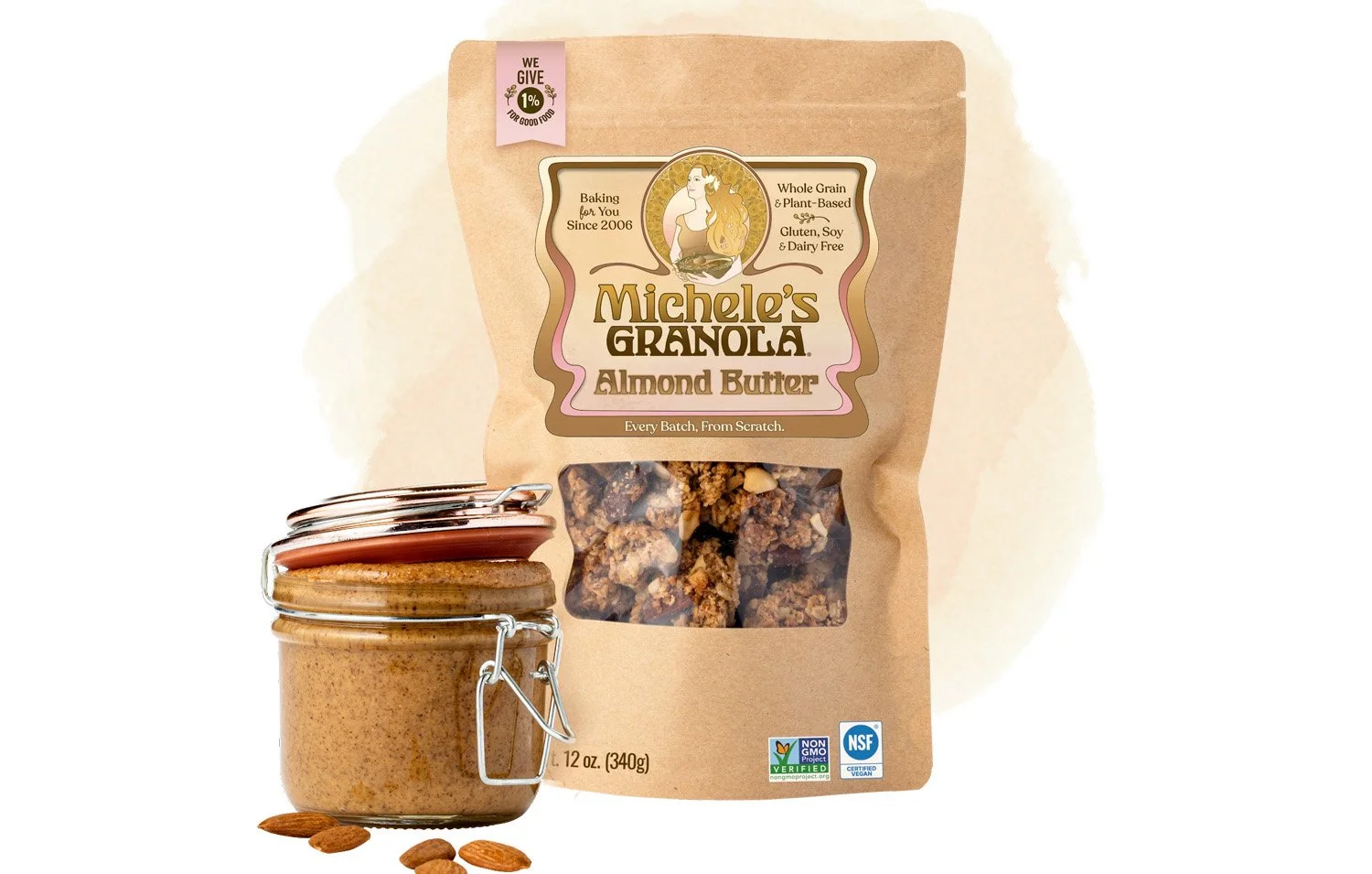
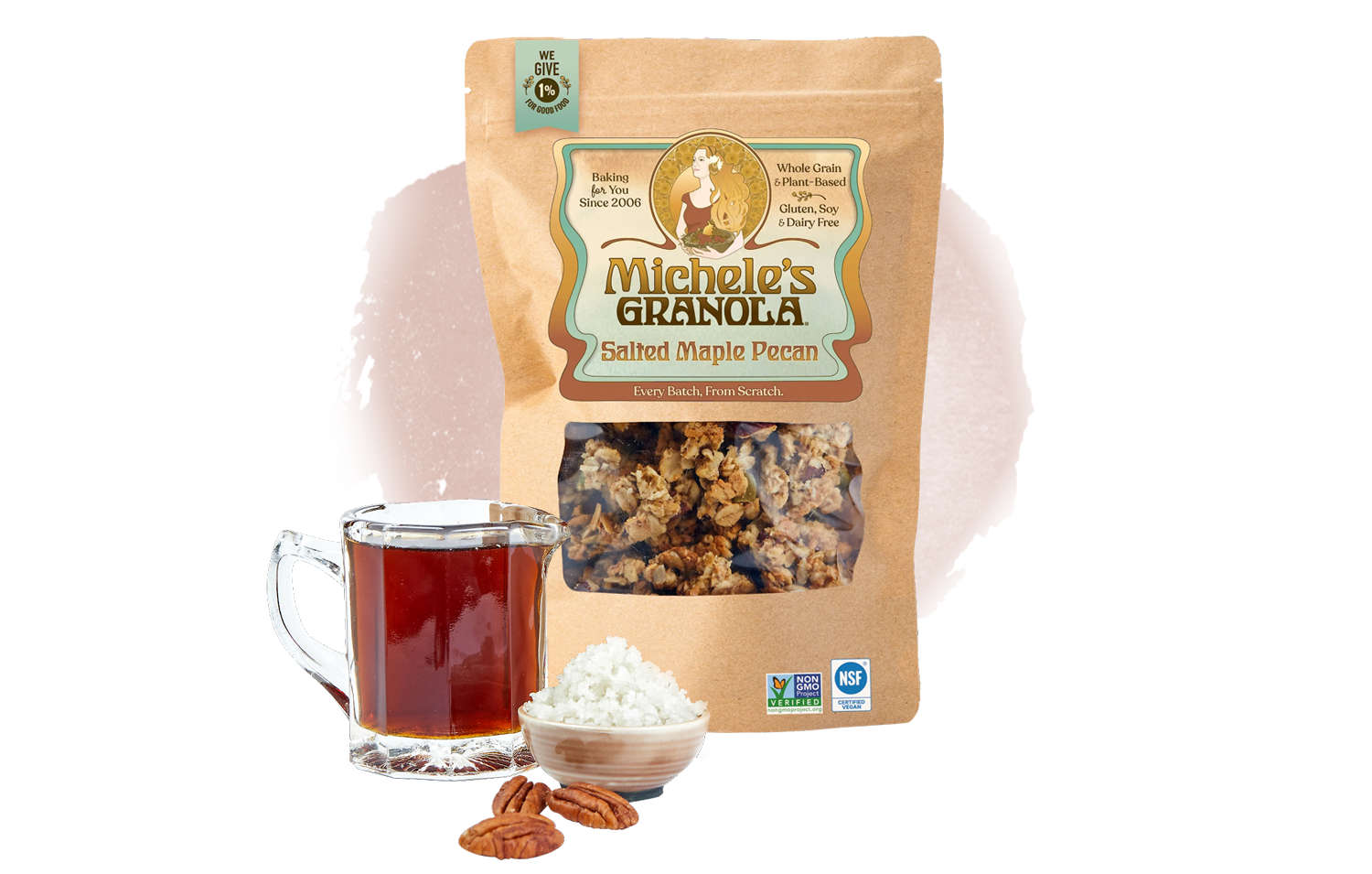
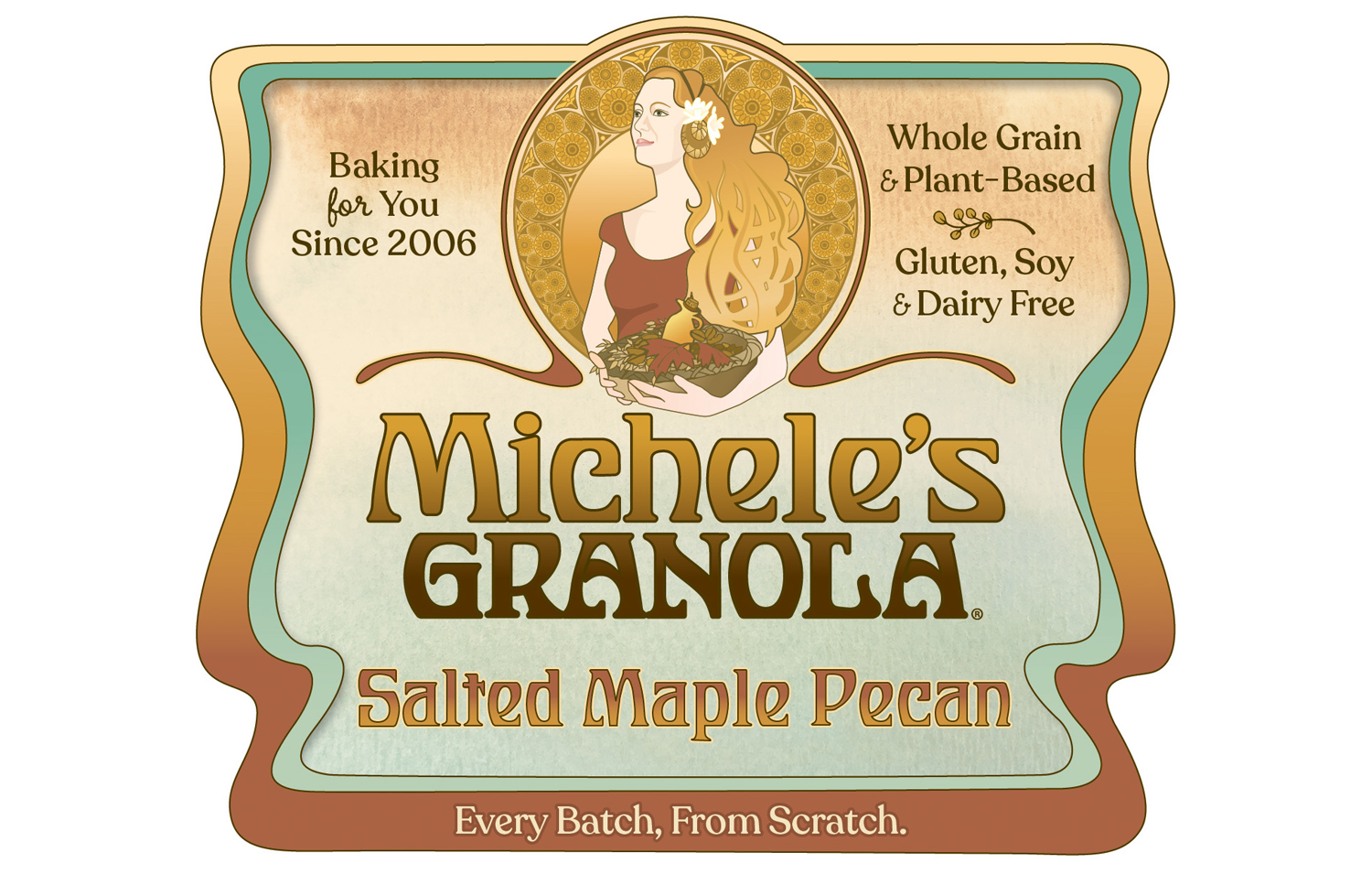
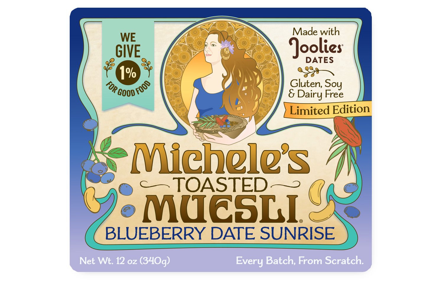
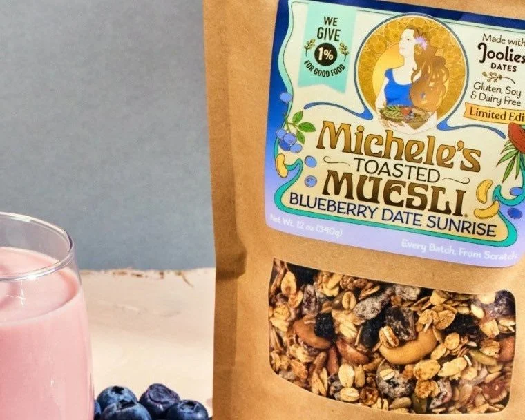
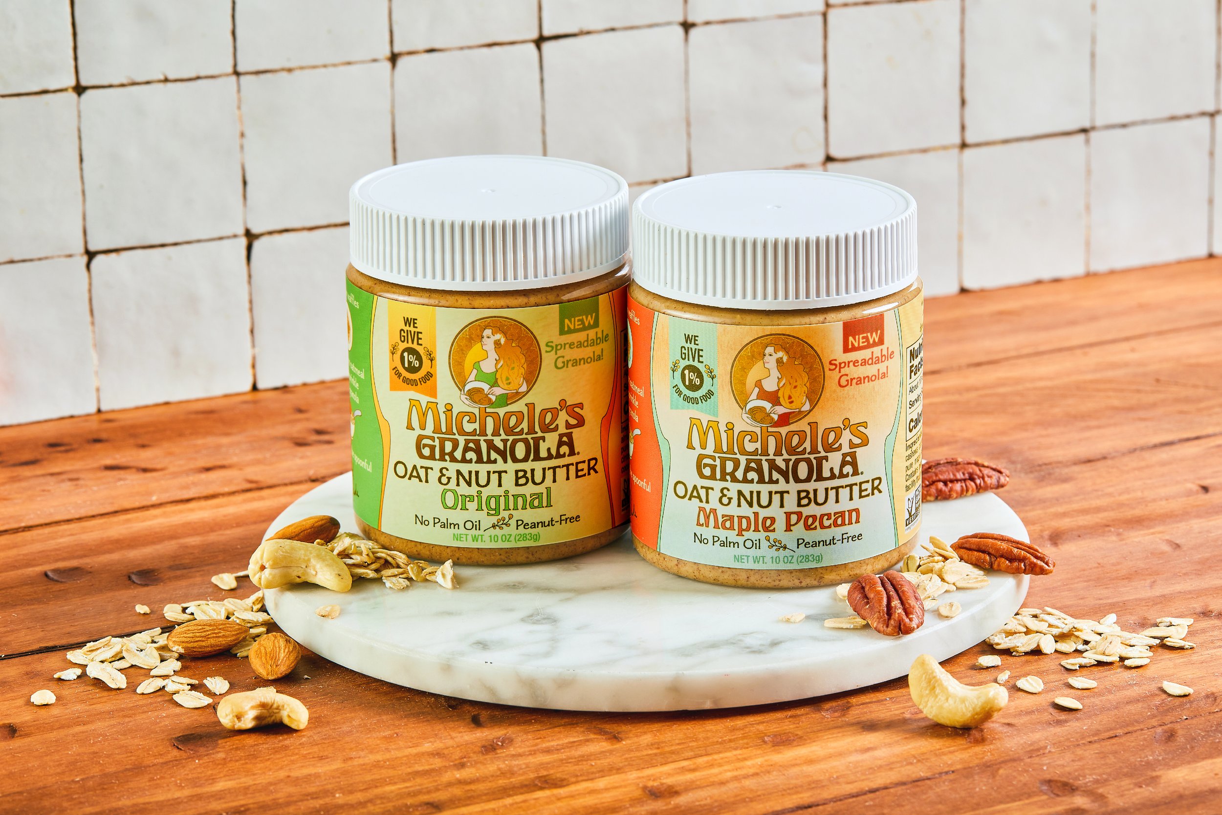
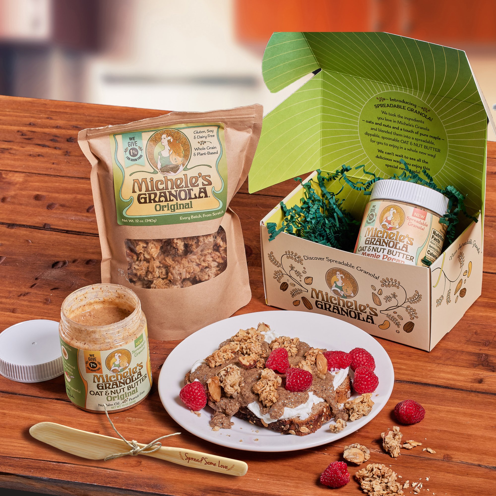
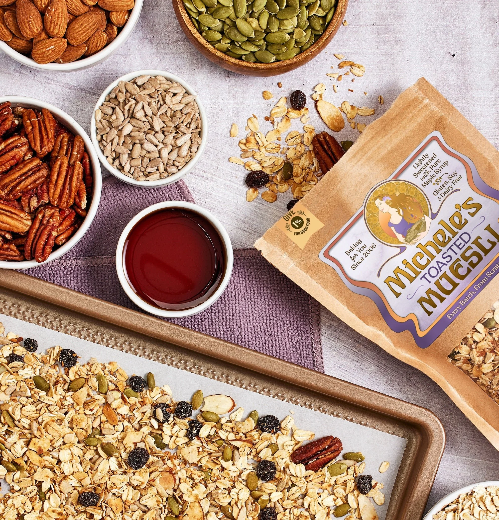
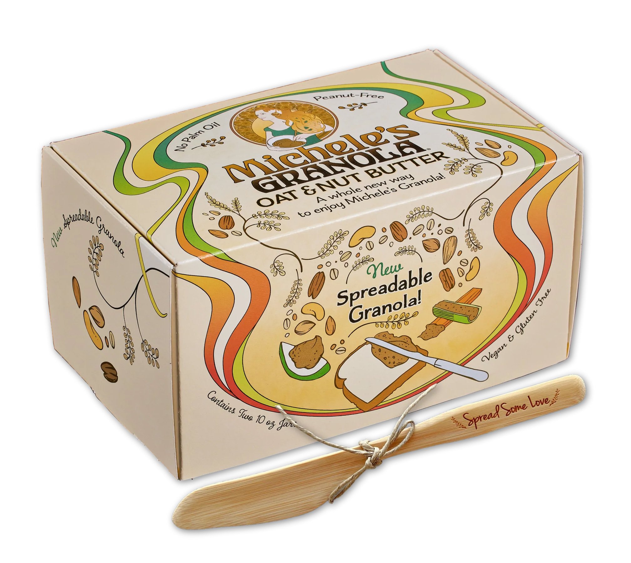
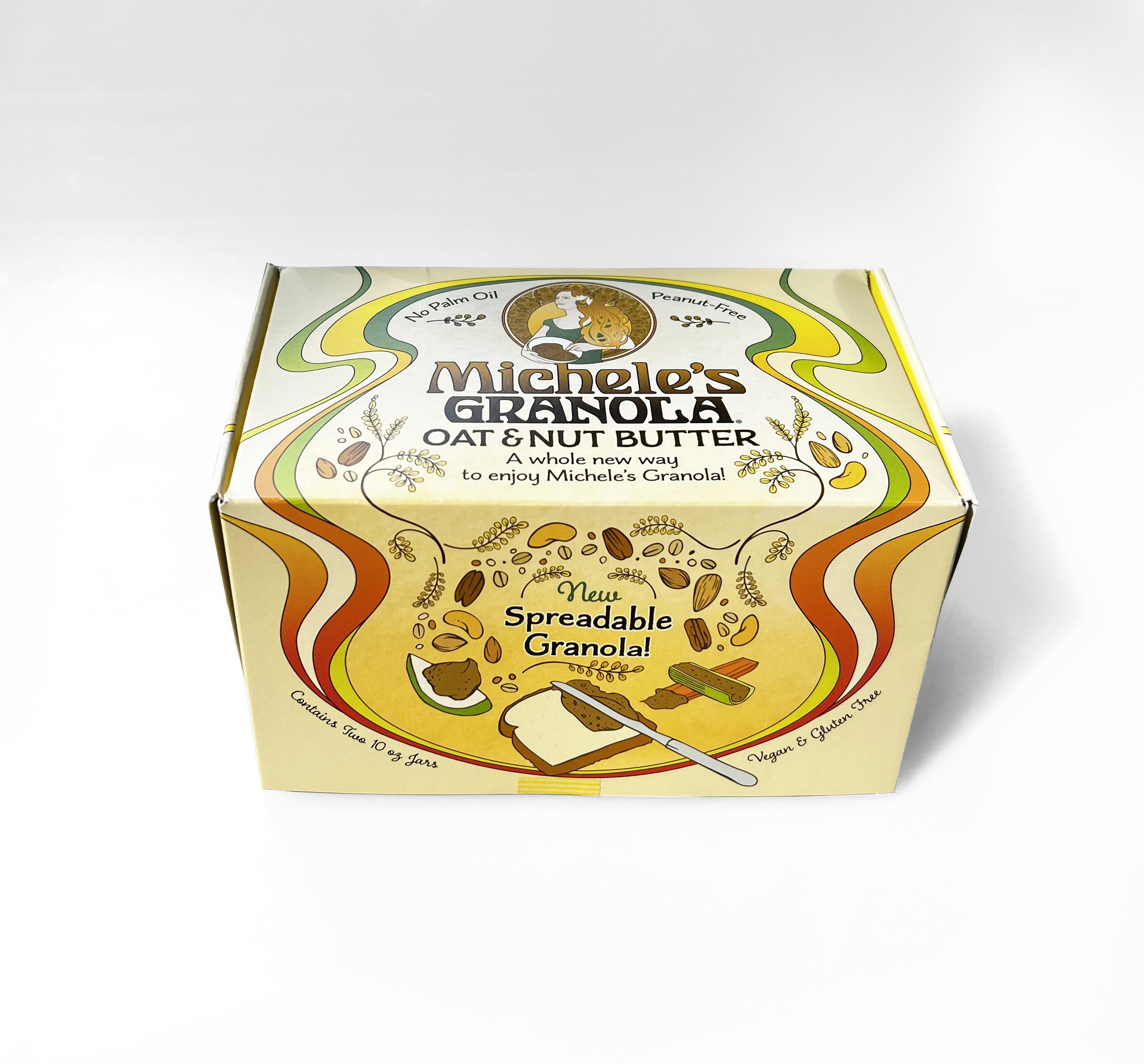
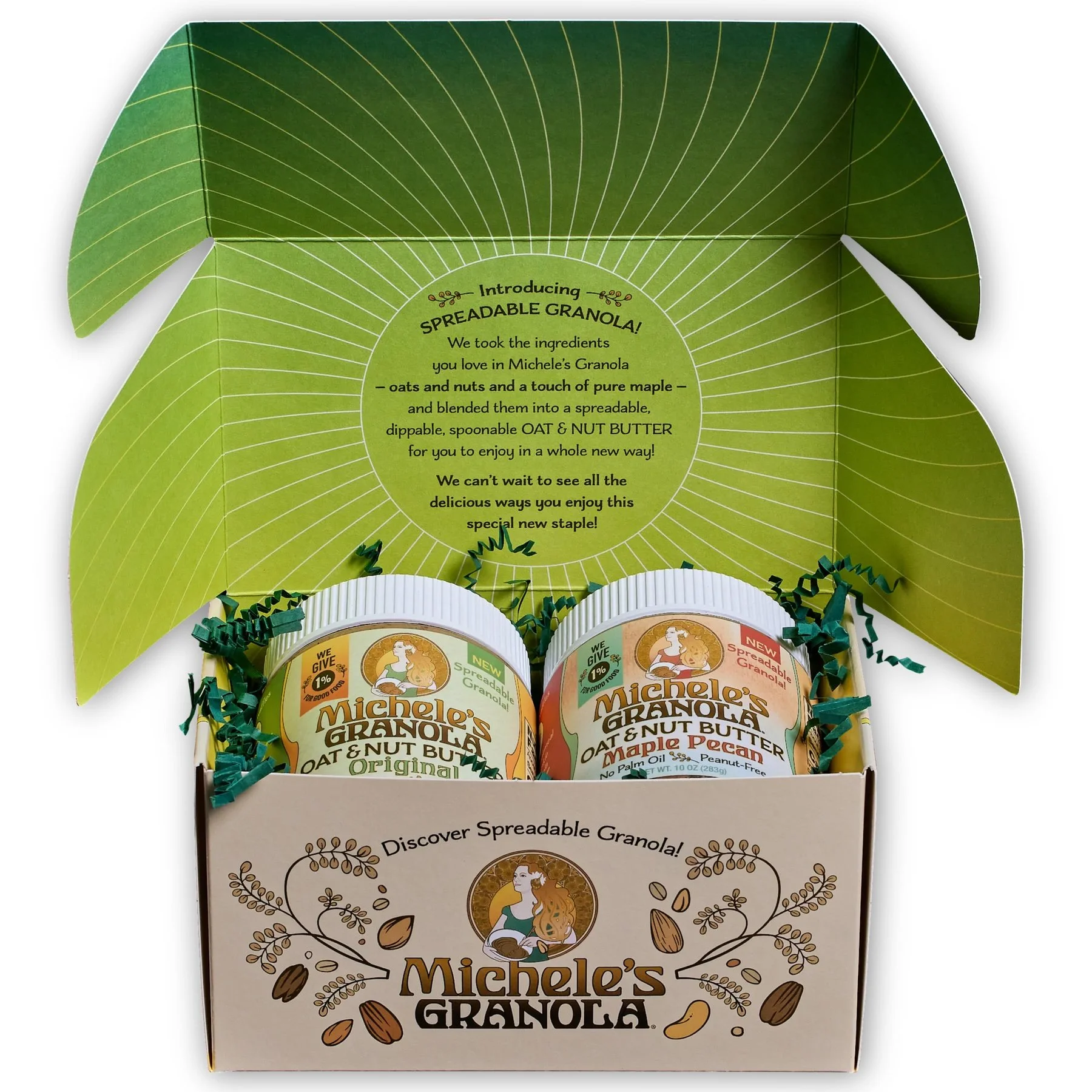
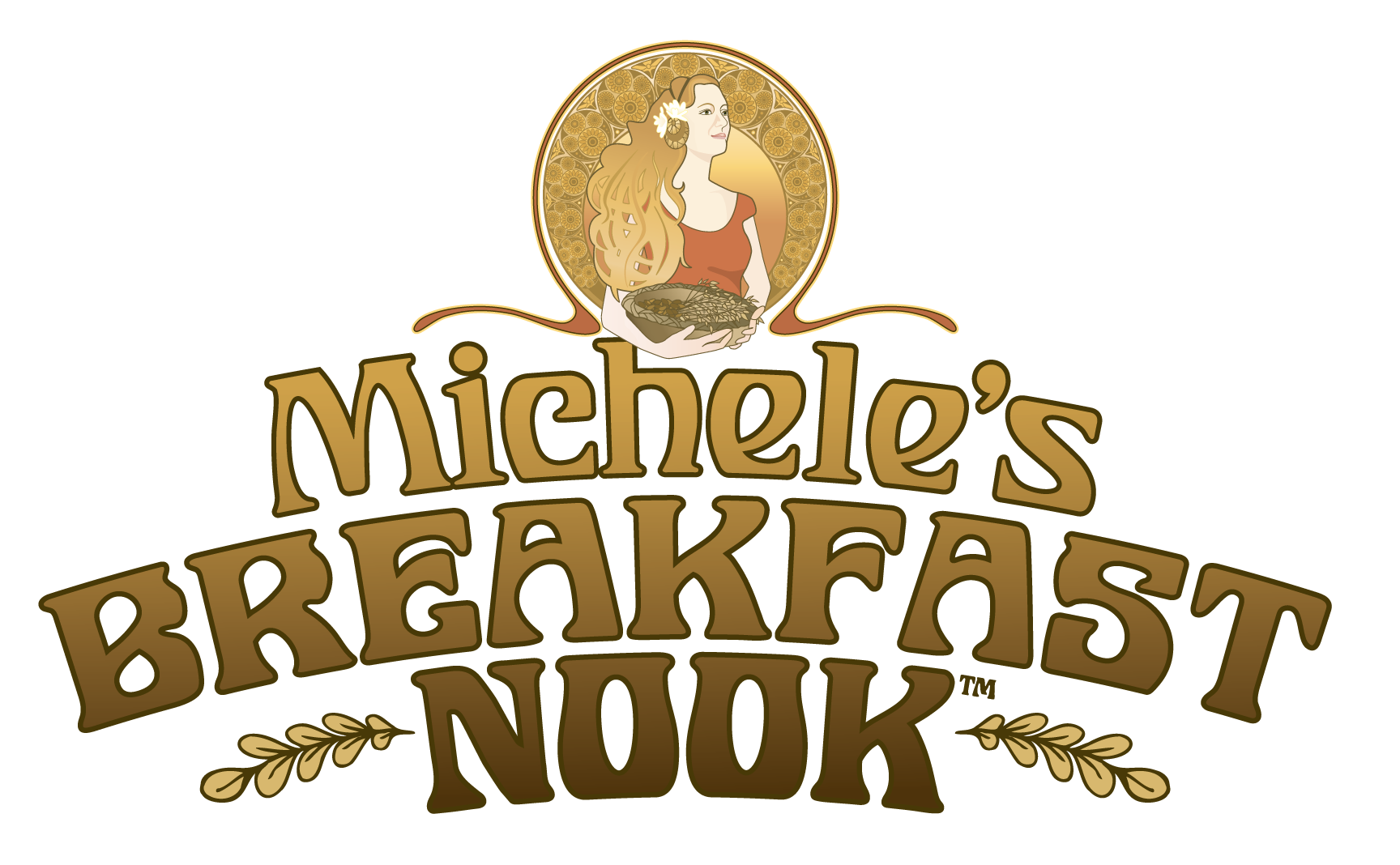
We created an Art Nouveau–inspired portrait to reflect the care and craftsmanship that go into every batch. Flowing organic forms suggest the aroma of freshly baked granola, while the illustration reinforces the wholesome, handcrafted character of the brand. Each flavor is distinguished by its own label color, with the contents of Michele’s basket changing to match, creating a visual system that is both flexible and expressive.
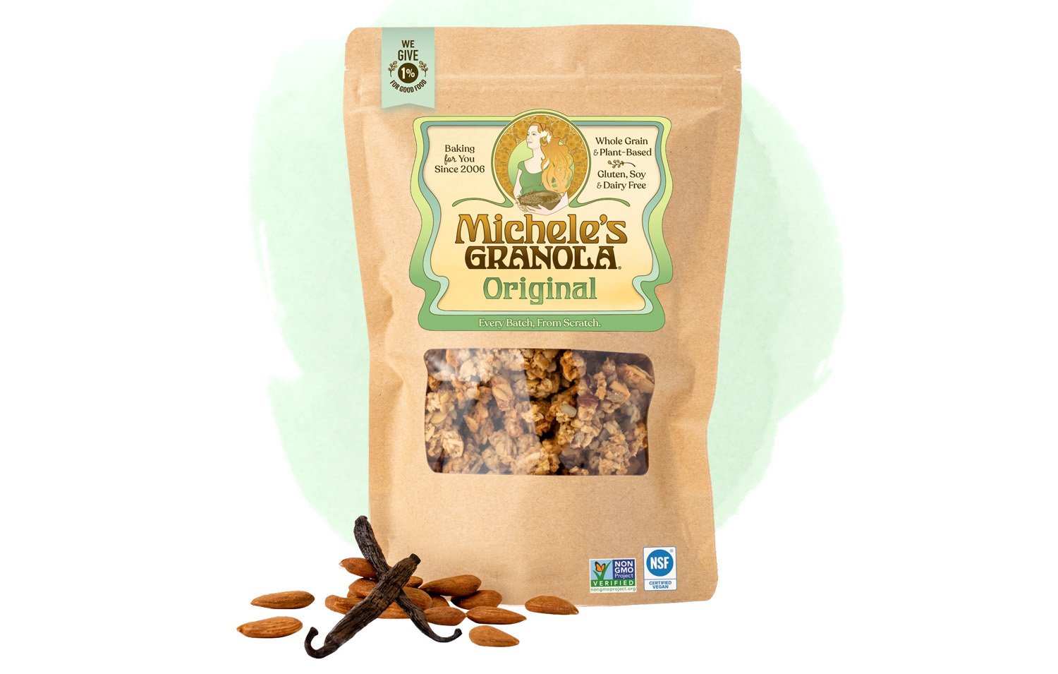
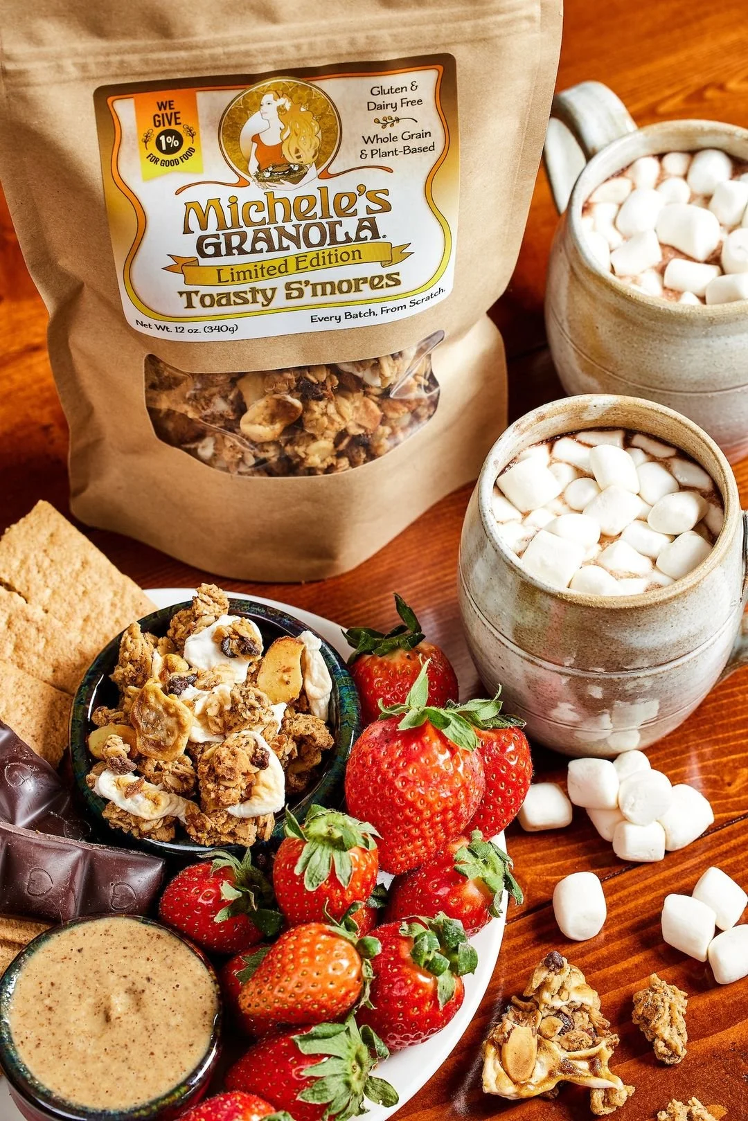
The kraft paper bag preserves the warm, authentic feel of the original farmers market packaging, while allowing the identity to grow with the brand. The system has also been adapted for seasonal and limited-edition flavors through custom labels and color variations, including a limited-edition package created with musician Jason Mraz.




Breakfast Nook
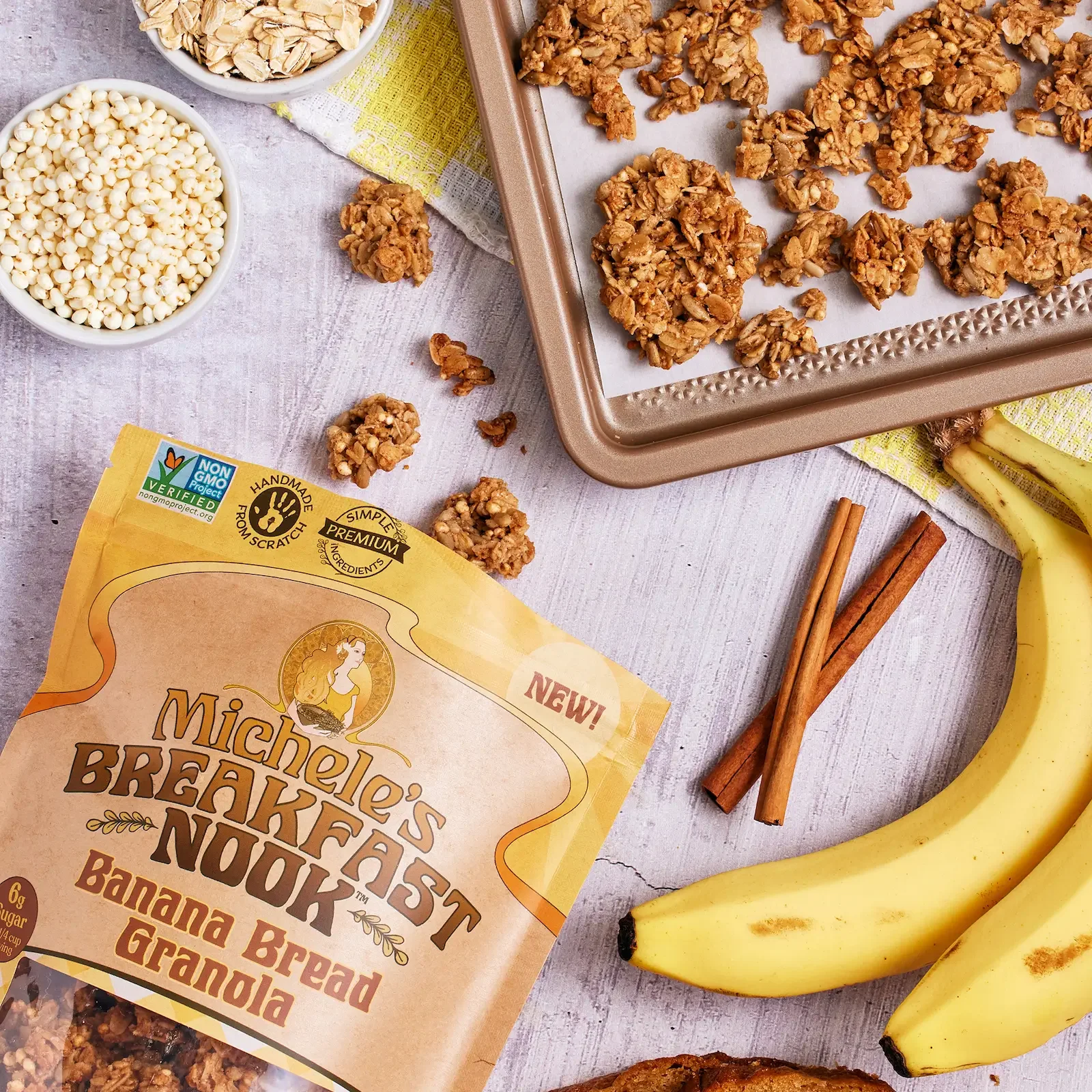
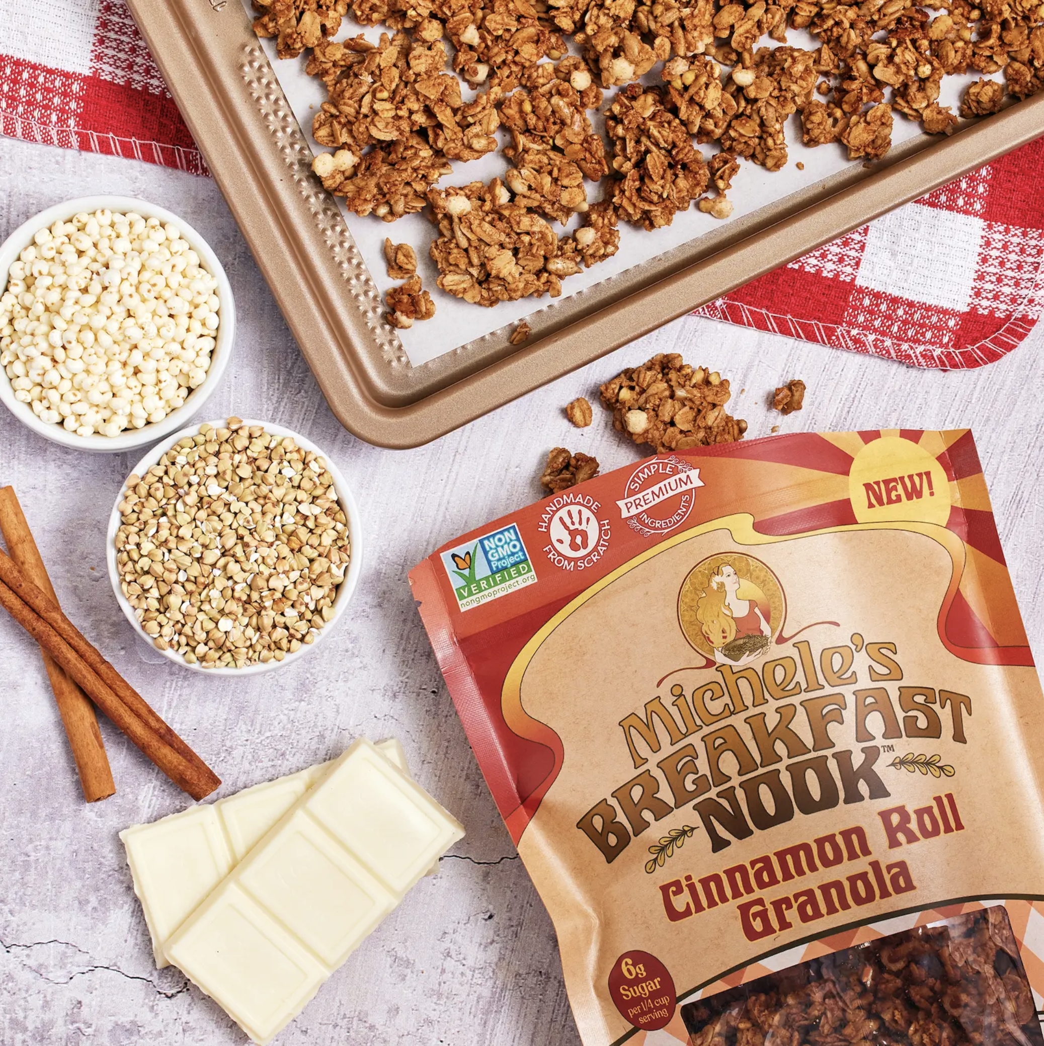
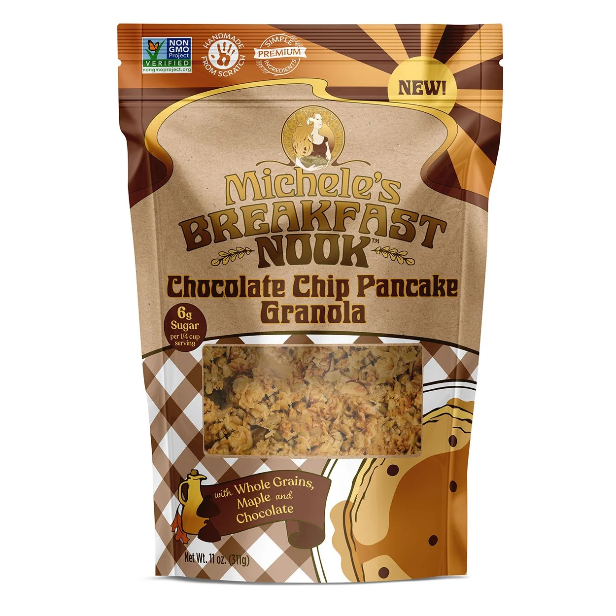
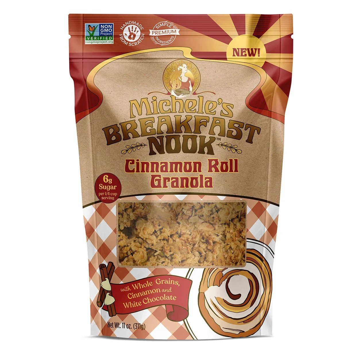
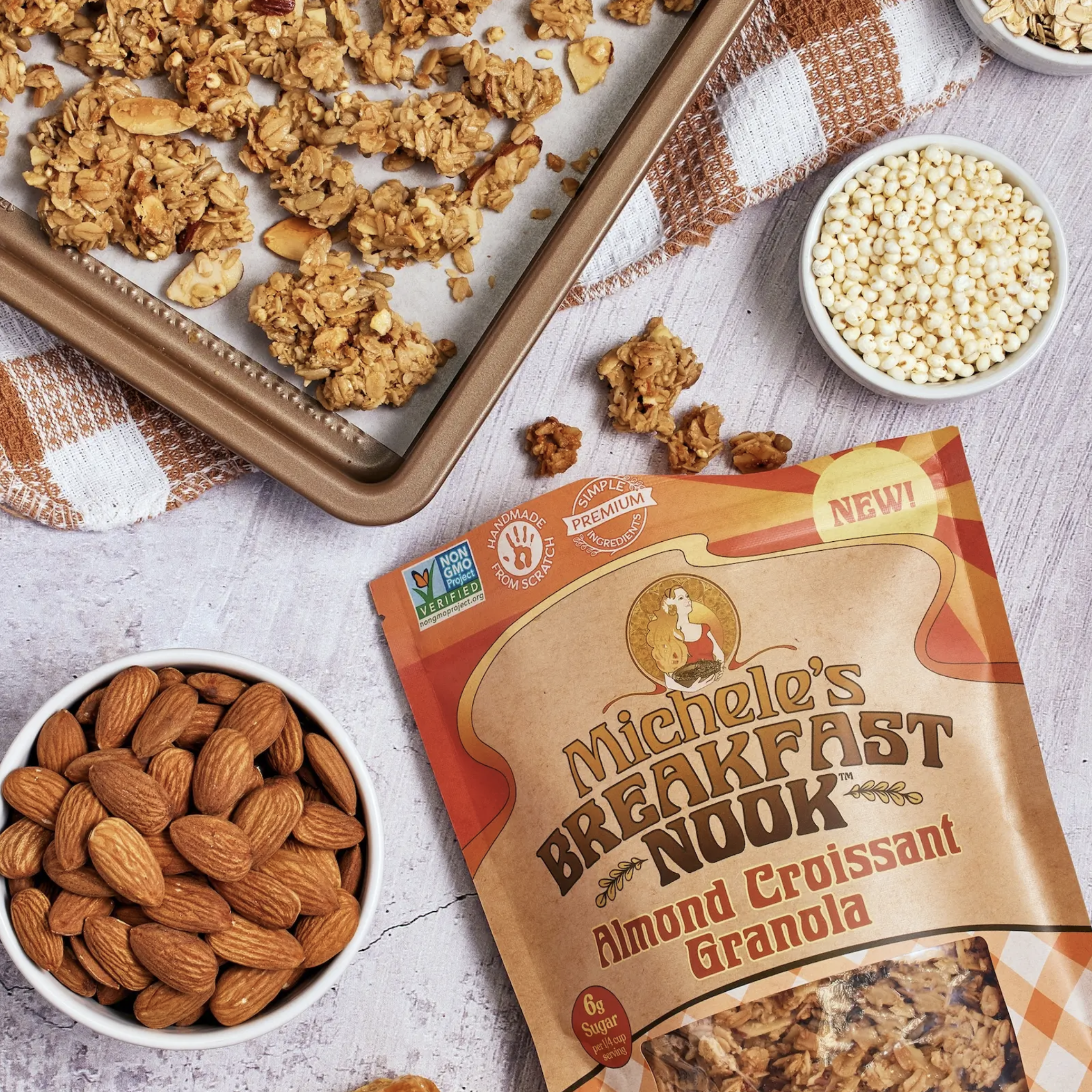
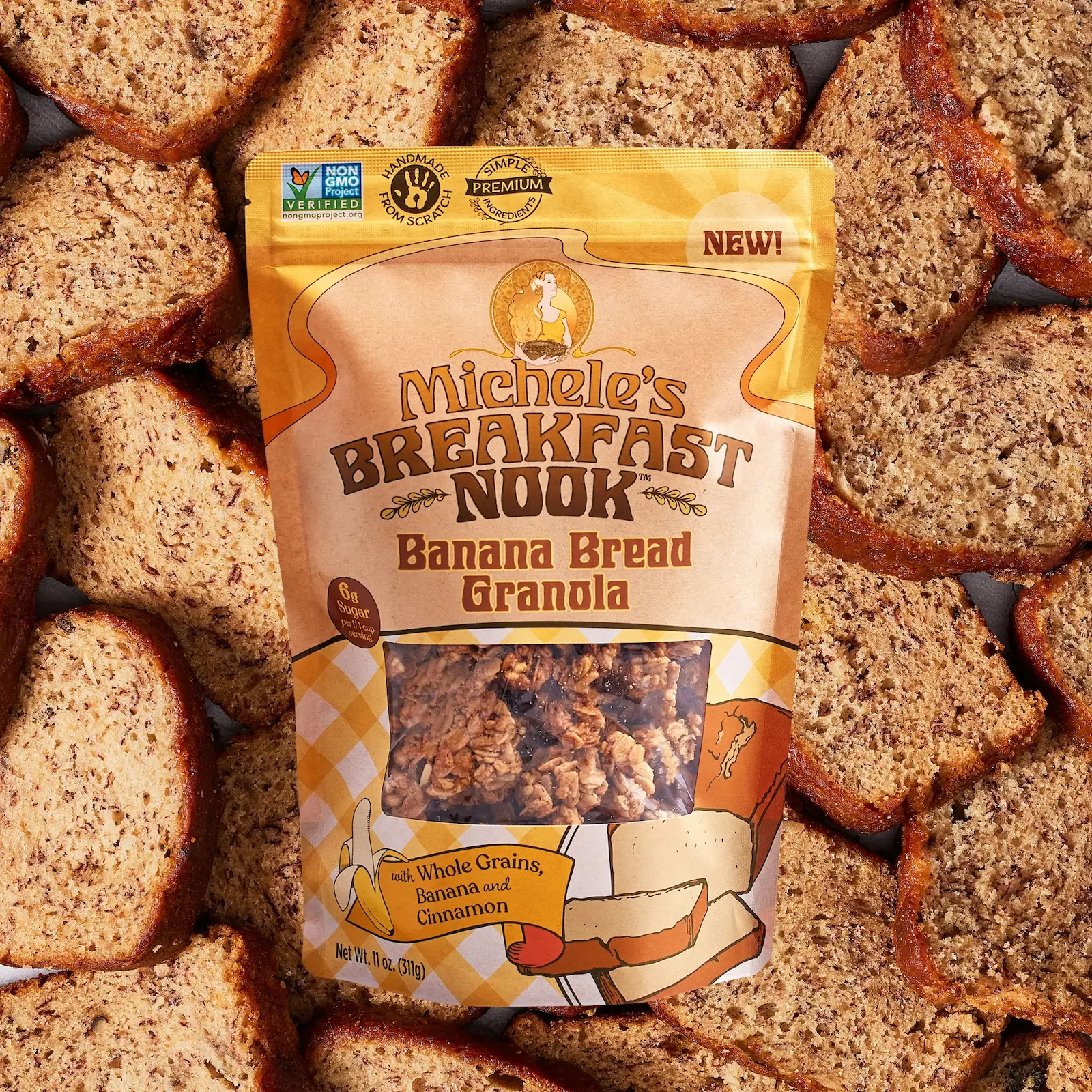
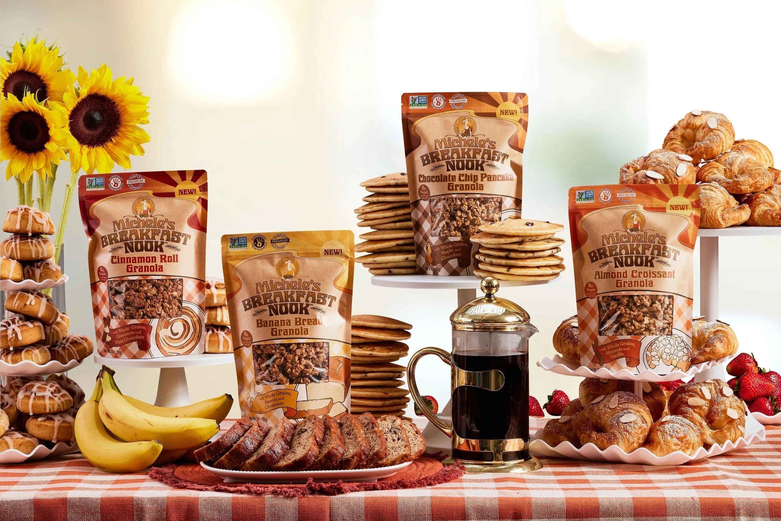
Michele’s Breakfast Nook is a new sub-brand from Michele’s Granola, with each flavor inspired by a breakfast classic — Almond Croissant, Banana Bread, Cinnamon Roll, and Chocolate Chip Pancake. I used a gingham pattern to evoke the feeling of a cozy breakfast table, and drew each flavor illustration by hand, giving every SKU its own personality within a cohesive system.