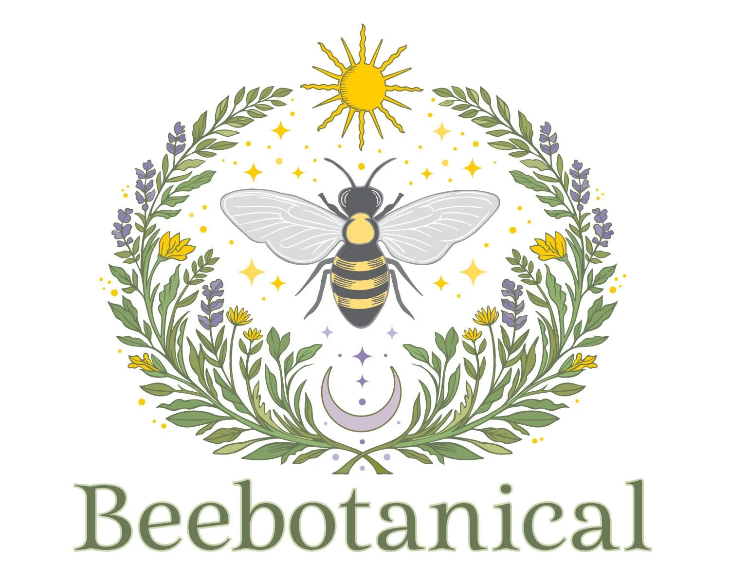
This client had designed a logo for her apothecary venture using AI. The design, below, has a magical feel, and it is pretty, but it is not scalable, and will not print well. In addition, it has a synthetic quality that does not work for her natural herbal products, and the type is disproportionately small and uninteresting.
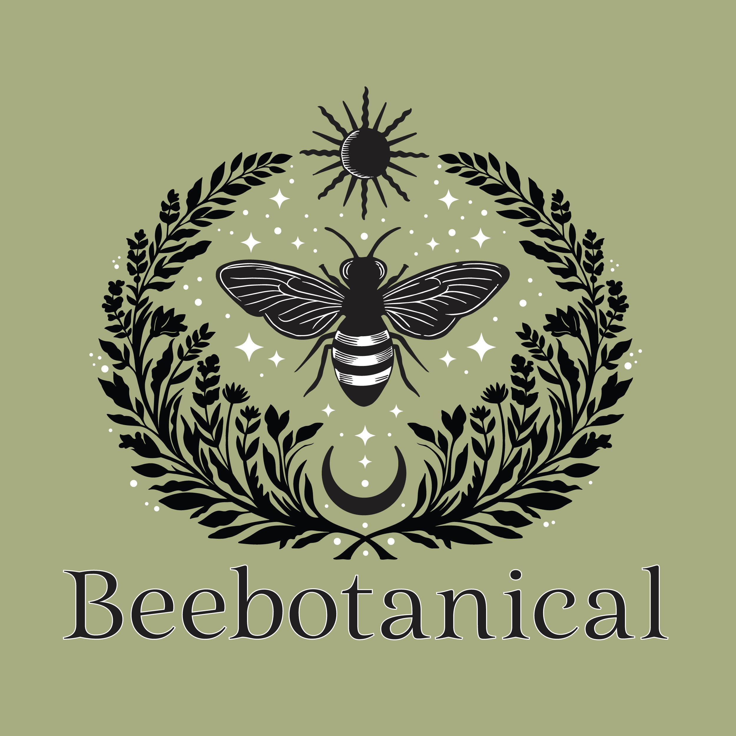
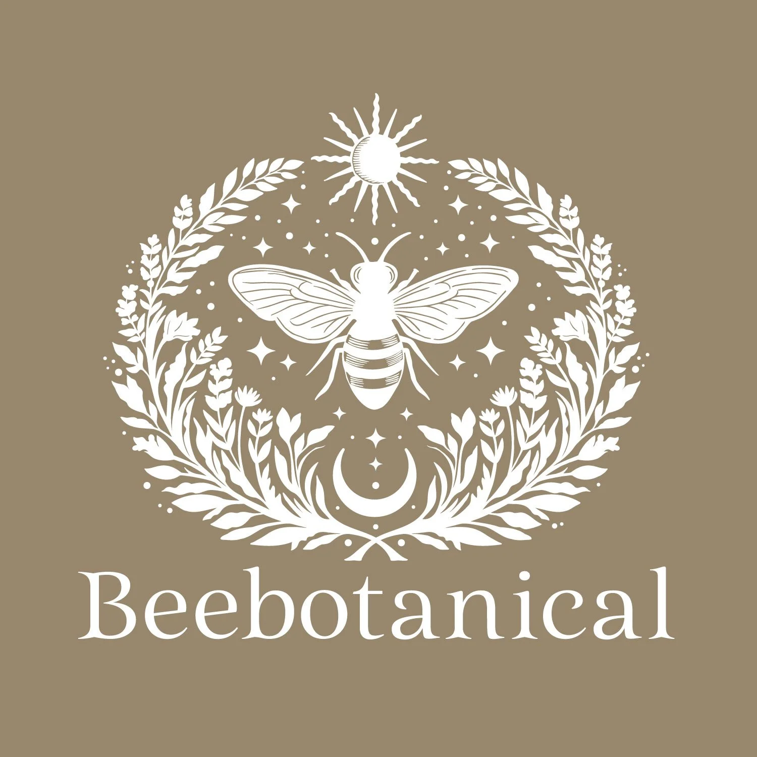
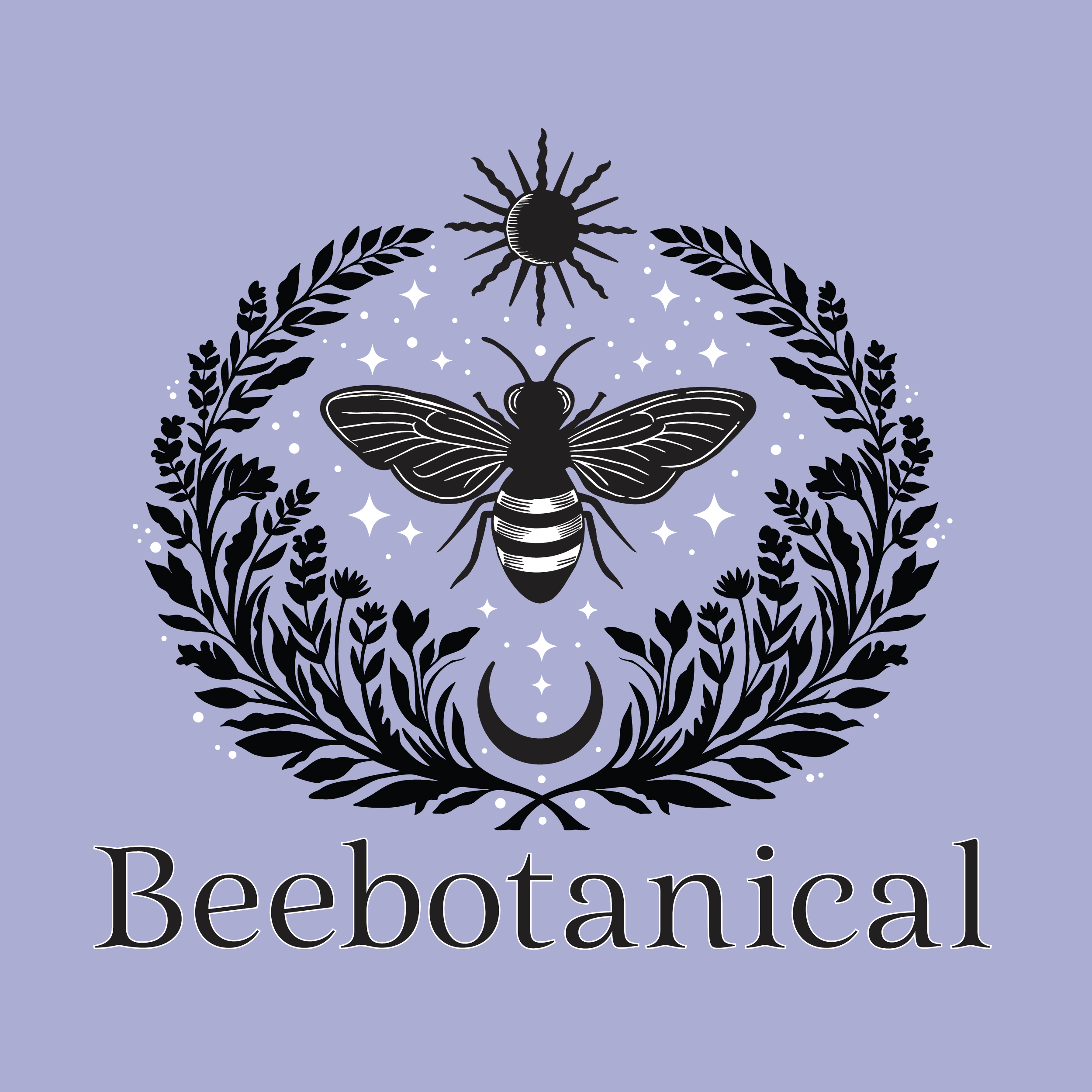
I reworked it for her and this, above, is the result. It also looks really beautiful in just black, or just white. She saved money and time by using AI to develop her concept, but was also open to my suggestions, such as making the wreath curve more gracefully, making the bee more natural looking, and rendering the whole thing with a similar line quality.